


Client
Free Range Games
Services
UI & Implementation
PC & Consoles
Platforms


Defining the Vision

Return to Moria is a survival game set in J.R.R. Tolkien's Middle-earth, focusing on the Dwarves' journey to reclaim their homeland. Free Range Games enlisted UX is Fine to develop a unique visual identity for the in-game interface. Given the iconic nature of the source material, our challenge was to create a fresh and distinctive UI that honored the lore while introducing a novel perspective.
Deliverables
Visual Exploration
User Flow
Brand Identity
UI Design
Pipeline for Iconography
Motion Design

Research & Inspiration
Our research aimed to establish a UI that felt both "of the time" and "handcrafted." We drew inspiration from:
Art Deco and Southeast Asian architecture
Fantasy novel cover art
Typography and graphic design from vintage TTRPG manuals
Color palettes inspired by Ralph Bakshi's animated adaptations
Recognizing the game's extensive inventory system, we emphasized making items the most vibrant elements in the UI, set against the neutral earth tones reminiscent of Moria's mines.

HUD & Inventory Design
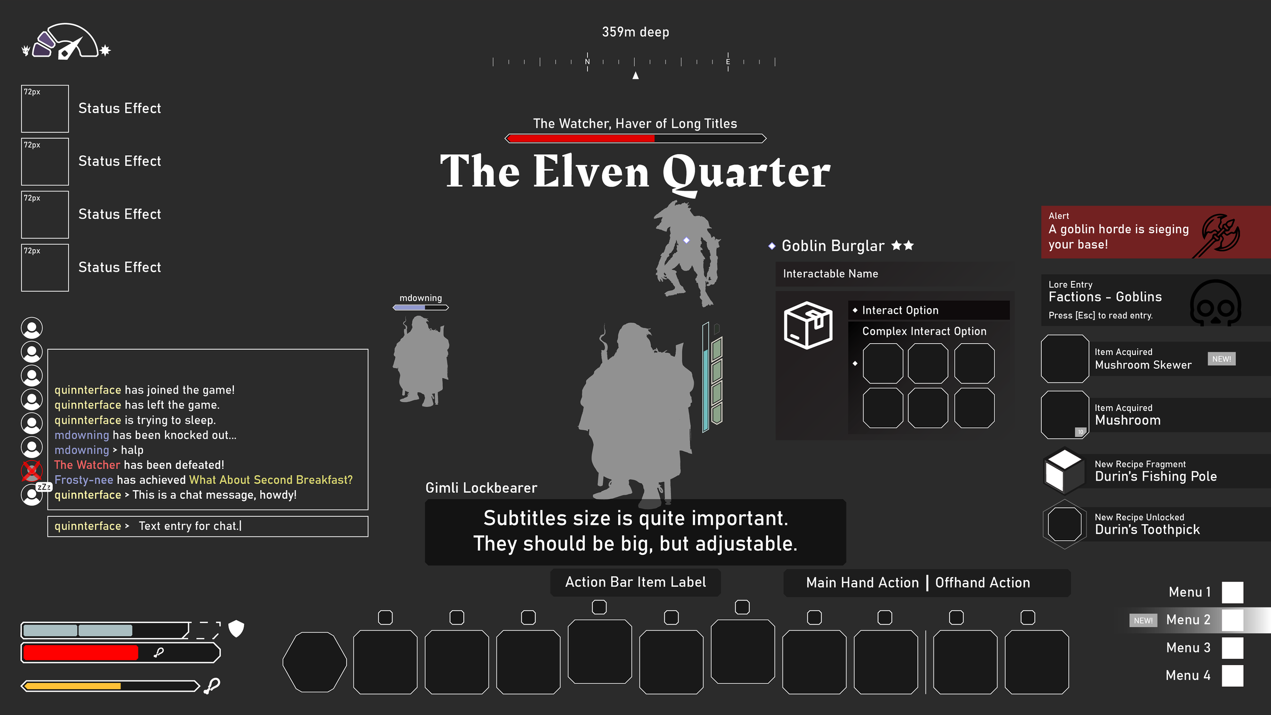
(Client-provided Wireframe)
Designing the HUD and Inventory required careful consideration, as the Inventory overlays the HUD and shares many components. We focused on developing a flexible and consistent style, refining shape language, color palettes, typography, and Dwarven motifs before extending the design to other screens.


(Client-provided Wireframe)


Lots of iteration
The HUD and Inventory were especially tricky—not just because they served dual purposes (in-game overlay and full-screen menu), but because they needed to feel cohesive no matter how they were used. That meant a ton of iteration early on.
We spent the first phase of the project narrowing in on the essentials: shape language, color palette, typography, and a visual system rooted in Dwarven runes and patterns. Every pass helped us fine-tune a look that felt handcrafted and immersive. Only once that core visual language was solid did we begin applying it more broadly across other screens.

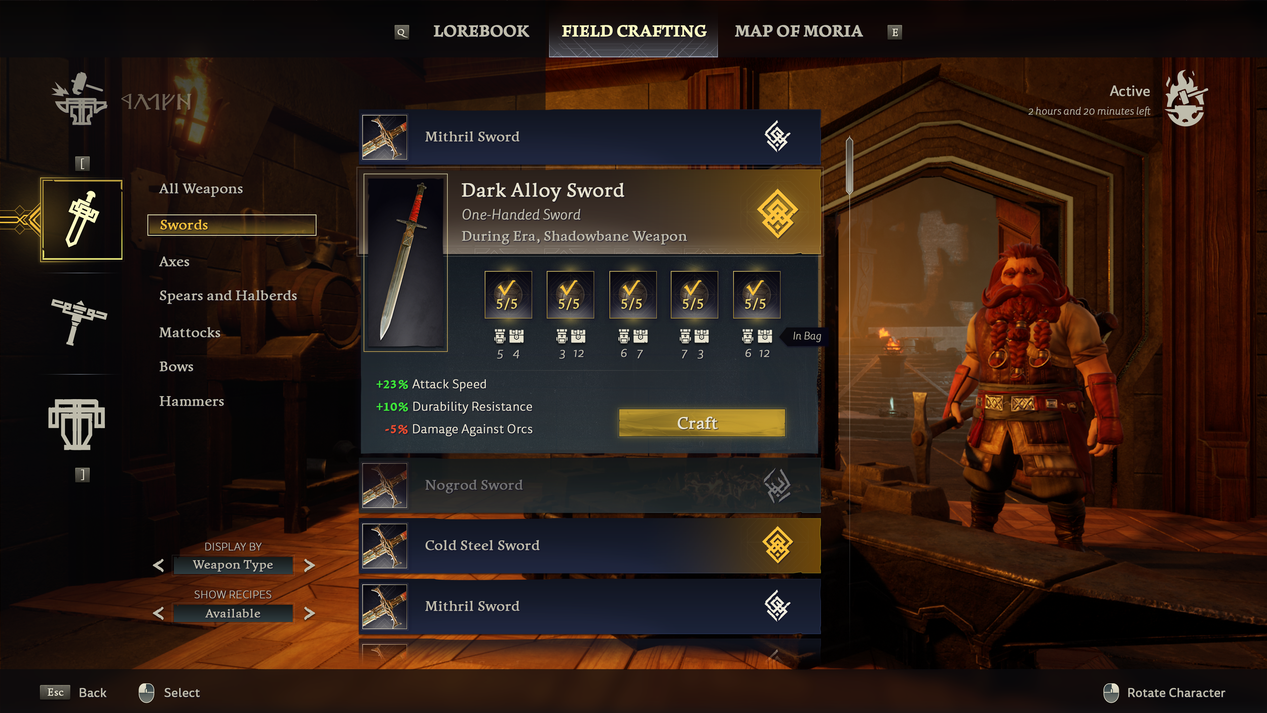
Crafting Screen
Crafting was our first real test of how well the HUD and Inventory style translated to other parts of the game. While some iteration was needed, the core visual system held up well.
This screen gave us the opportunity to expand the aesthetic—introducing flat icons, refining layout behaviors, and weaving in more of the runic alphabet to strengthen the connection to the world’s lore.

(Client-provided Wireframe)

Character Creation

The character creation flow was an ideal test bed for expanding the UI kit. It brought together a wide range of interactive elements—sliders, spinners, scrollbars, multiple button types, and a dynamic character model—all in one screen.
Designing around that variety helped us solidify the visual language and ensure consistency across the full interface.
(Client-provided Wireframe)


Map
The map presented challenges on multiple fronts—from technical implementation to establishing a visual identity that fit the world. UX is Fine supported both the high-level direction and hands-on development of the screen, contributing new elements to the UI kit along the way.
Early on, we landed on a “layers of vellum” material reference—a direction that quickly resonated with the team. It evoked the idea of a living, in-world artifact rather than a traditional game map.
Given the procedural nature of level design, we imagined the map as a personal journal your Dwarf actively updates during their journey. This led us to explore hand-drawn aesthetics inspired by old technical drawings, field notes, and blueprints—grounding the interface in the lore while keeping it highly usable.


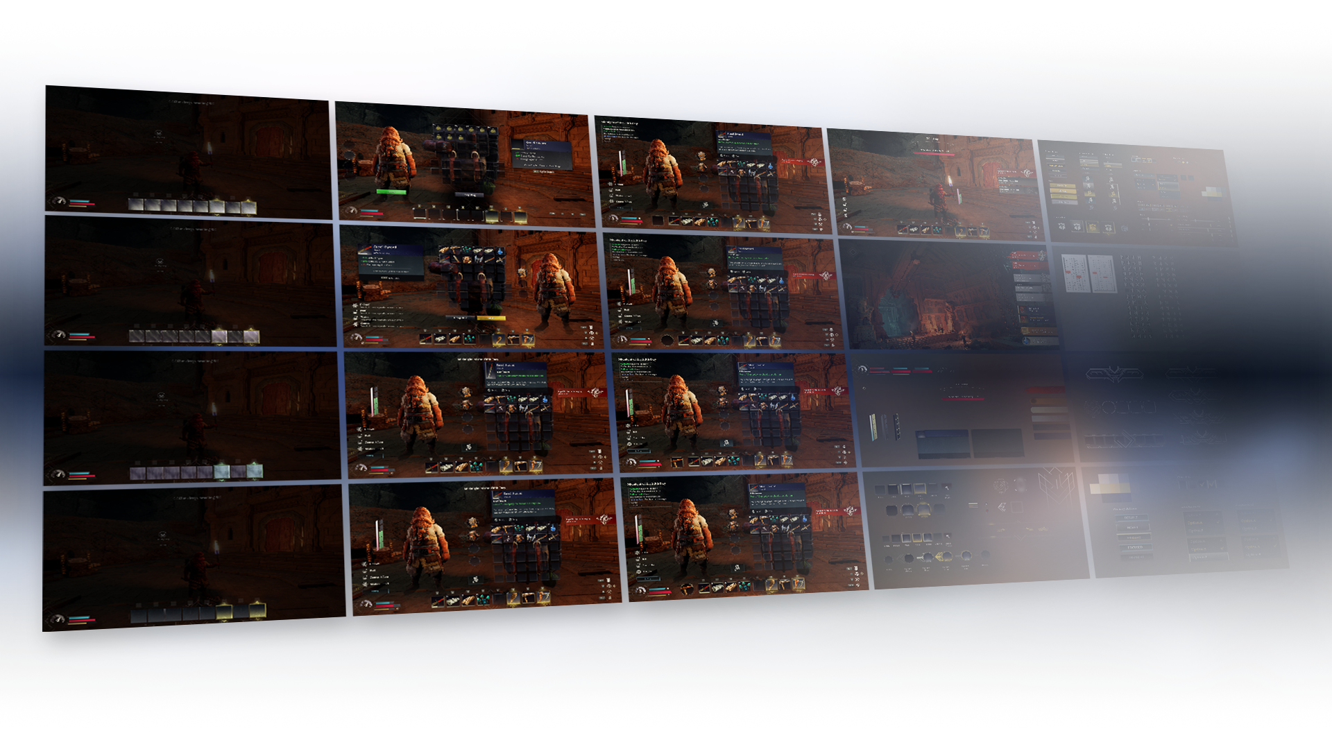
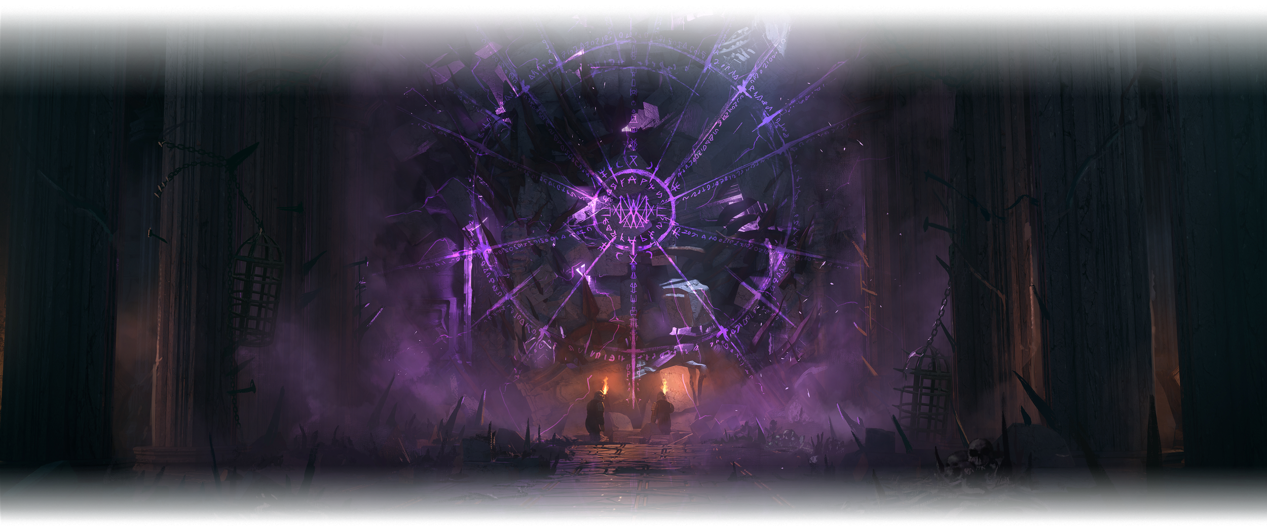
Early In-Engine Development

Atlas Development

Typography & The Angerthas
Typography was one of the first things we wanted to get right, especially given how prominently it featured in the project brief.
The team aimed to preserve a sense of whimsy in the font choices—intentionally steering away from modern UI trends that felt too clean or sterile. Geometric or multiple sans-serif fonts would’ve risked stripping away the character we were after.
In addition to selecting typefaces that aligned with the overall aesthetic, we also created a custom set of runes based on The Angerthas (Cirth) to represent the Dwarven language. These runes were integrated into screens and UI elements to deepen the connection to the world’s lore.


IconS
Rendered Icons
Our goal for the inventory icons was to make them feel like the stars of the interface—standing out across the HUD and in player menus like the Inventory screen.
Since this is a survival game, we wanted the tools, gear, and resources players collect to carry real visual weight. The items you craft are hard-earned, and the UI needed to reflect that sense of value and reward.
With hundreds of icons to produce, we developed a streamlined pipeline: starting with item renders from the engine, we applied a fast, repeatable touch-up process that brought clarity and polish without slowing production.


flat Iconography
We developed several sets of flat icons to support various systems across the game. These included interface staples like Settings and Notifications, as well as more specialized icons for the Map.
Each icon had to function at multiple scales—remaining legible both in compact menu layouts and when displayed larger on the HUD. Consistency, clarity, and quick recognition were key across the entire icon system.


“UX is Fine not only delivered a great vision for the look and feel of our game's interface, but they leveled-up the team at the same time. Was a terrific investment for our small crew."
-JON-PAUL DUMONT
Game Director - Free Range Games

Thank you for viewing
MORE Case Studies
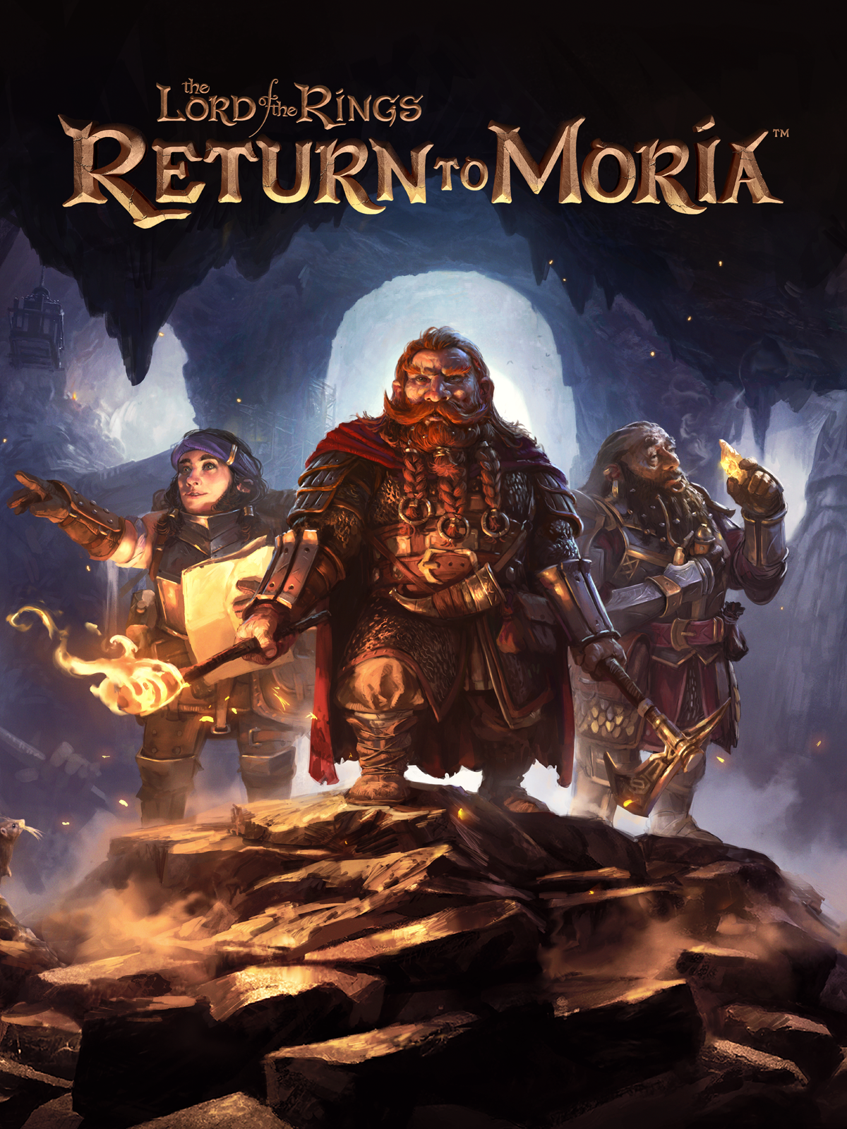
FREE RANGE GAMES
lotr: return to moria
A survival game for PC and consoles, set in the world of J.R.R. Tolkien's The Lord of the Rings.

WILDCARD ALLIANCE
Wildcard
A PvP collectible-card-based arena action game with a pro-sports design aesthetic.

BAZOOKA TANGO
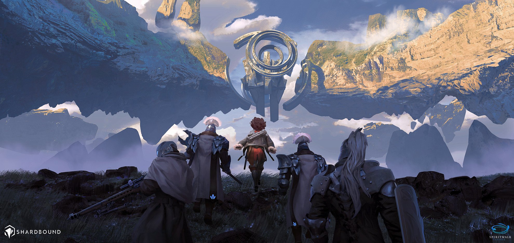
Shardbound
A tactical strategy card game set in a sci-fi/fantasy world.

STOIC STUDIO
A side-scrolling action RPG where players defend humanity’s last stronghold in a post-apocalyptic world.

