

Lazy and Last Minute: UX is Fine’s Logo ORIGINS
On Thursday, August 23, 2018, at 4:15 pm, I got a message that kicked off everything:

“Logo… Can we get something for an email? Doesn’t have to be fancy.”
– Jason Schklar
UX is Fine had just signed on as a last-minute sponsor for the IGDA Game Leadership Summit, set for September in Austin. The event team needed our logo. That day.
There was just one problem:
We didn’t have a logo.
Or a real website.
Or, depending on how one defines it, an actual company yet.
A Late Afternoon Slack

We’ve always been asynchronous at UX is Fine. There is no physical studio or HQ—just a talented team of people working wherever they happen to be.
That day, I was in my upstairs home office in Maryland when Jason, a fellow UX is Fine co-founder who calls Texas home, pinged me on Slack to follow up on his email request (he knows I’m kinda not so great at regularly checking email). We needed to send a logo immediately, as the IGDA Summit email blast was going out the next morning.
We had a name.
We didn’t have a mark.
But we did have a window of opportunity.
This was our chance to look legit, get on people’s radar, and plant a flag. We needed to look like we’d been around the block—even if we’d barely filed the paperwork.
I had mere hours.
Now, logos aren’t supposed to be made in a couple of hours.
Good ones take time. Research. Focus groups. Rounds of refinement.
But this wasn’t that kind of situation.
So I cursed a little. Rolled my eyes a lot. And got to work.
From Meme to Mark
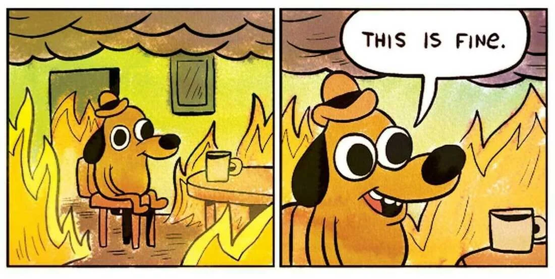
The panel from KC Green's web comic strip "On Fire," became a popular online meme by 2014
I started with the only visual reference that made sense then: the “This is Fine” meme. It was honest, relatable, absurd—and perfect. Games are rarely not on fire.
I dropped the meme into Photoshop, stared at it, and started sketching. I tried personifying “UX” as a little character sitting in the same posture: sipping coffee, surrounded by chaos.
Something about it felt right. But I wasn’t in logo headspace—I was in sticker headspace.
As a kayak fisherman and outdoor guy, my life was covered in stickers. They’re how we mark our gear, show our affiliations, share our identities. And I’d been making lots of sticker art in Procreate then. That was where some of my best design energy lived.
So I saved the sketch to Google Photos, walked downstairs, grabbed my iPad, and pulled the file into Procreate. Time was tight, but my instincts kicked in.
Breaking the Box: From Square to Silhouette
The first thing that had to go was the square.
Square stickers suck. They’re forgettable. You want a die-cut silhouette—something bold, irregular, eye-catching. The kind of thing you want to slap on a laptop or cooler.
As a concept art teacher, I always tell students to start with the silhouette. Make sure your shape reads from across the room. Don’t get lost in details. Work broad. Work fast. Solve the shape first.
And that principle became the heart of this logo.
I shaped the flames into a bold top contour, rounded out the bottom for a clean, circular base, kept the stool and the cup, and pushed the negative space so it stayed readable when tiny.
I wanted it to work as a sticker, sure.
But also a tattoo.
And an embroidered patch
And on a favorite backpack.
And on a treasured fishing hat.
And a favicon.
And a logo on a mobile site.
So I zoomed way out, stripped away noise, and simplified everything that didn’t need to be there—especially any remnants of the original meme.
The final result kept the charm and clunk of the meme but translated it into something new.
A respectful nod back. A reimagining forward.
The Last Decision: Color and Commitment
The last thing that bugged me? The colors.

Before Color Adjust
Up to this point, I’d stuck closely to the meme palette. And if you’ve looked at that meme, those colors are rough. Limey greens. Sickly yellows. The whole thing feels like it was drawn with highlighters.
It’s perfect for the meme. But did we want to carry that look into our brand?
I debated. For about 45 seconds.
Then pivoted.
I warmed the whole thing up—pulled it into earth tones and deeper oranges. It was still quirky and awkward in the right ways, but with a palette that felt more grounded and alive.

After Color Adjust
That was it.
I sent it to Jason.
No revisions. No committee. No time.
He emailed it to the summit team. The IGDA blast went out the next day.
Just like that, UX is Fine had a logo.
A Final Reflection: Lazy by Design

What still strikes me is this:
The logo was made in ~90 minutes. And it’s still with us today.
That’s not a fluke. It results from trusting a creative process that doesn’t worship complexity.
This year, I’ve been working with our crew of directors around a core principle:
Don’t let the perfect be the enemy of the good.
In games—and creative industries in general—we tend to assume that quality always comes with scope. That great results take time, money, and overbuilding. But that’s often just inertia talking.
Sometimes, a “lazy” approach—a direct, off-the-shelf, low-friction solution—can outperform the bespoke, overthought, bloated one. Sometimes, a slapped-together logo in Procreate tells your story better than a six-week brand sprint.
Related to this, I’ve seen professional websites that are beautiful on the surface but painful to use. They’re packed with animation, hard to scan, and often useless on mobile. That’s not sophistication. That’s an expensive and overdeveloped distraction.
So I’m leaning in.
To “lazy.”
To fast.
To simple.
To trusting the process when time is short and stakes are high.
That’s how this logo got made.
It was an impossible ask.
And I’m still proud of it.
A logo, a deadline, and a mindset we still believe in.
UX is Fine. And we are too.

and an essential closing thought…
On Originality and the Meme
The logo draws clear inspiration from KC Green’s “This is Fine” comic—a visual touchstone that perfectly captured the tone we needed in that moment: calm in chaos, darkly funny, slightly unhinged.
At the start, I sketched directly over the meme. It helped me work fast—blocking in the silhouette, exploring layout, finding a rhythm. But as the piece took shape, I made a deliberate effort to paint out every trace of the original. Every element was reinterpreted. Nothing from the underlying comic remains in the final image.
Still, we took it seriously. My co-founder Jason reached out to KC at the time, just to be sure we weren’t stepping on anything. KC responded generously, with a clear and thoughtful take that confirmed what we’d hoped: that the final image—detached from the original artwork, reinterpreted through our own lens—stood on its own as parody and fair use.
That said, I’ve always carried a small, nagging wish that it had been 100% original from the outset. But the intent was honest. The execution was deliberate. And the meme gave us exactly the spark we needed when the room was (literally) on fire.
About the Author

Dave Inscore has been building worlds and leading creative teams in the game industry since 1995. He began his career at the legendary MicroProse Software, later co-founding Big Huge Games in Baltimore, where he served as Art Director on acclaimed strategy titles like Rise of Nations and Rise of Legends. (The latter was described as “a playable piece of art” and “the best-looking RTS I’ve ever played.” Dave did not write those reviews, but he agrees with them.)
He went on to lead teams at Zynga during the rise of social gaming, deliver a GDC talk or two, and eventually co-founded UX is Fine, where he now serves as President. Under his leadership, the studio has earned a reputation for delivering standout UI/UX, motion design, and 2D visual systems for top-tier game developers across a range of genres and platforms.
When not pushing pixels or mentoring the next generation of artists at MICA, Dave can usually be found on the water. He’s an accomplished kayak angler and outdoor photographer, and his work has appeared on the cover of Kayak Angler Magazine three times—which, for the record, is more than any other angler. He won’t bring it up unless you ask. (But he’ll definitely bring it up if you ask.)
