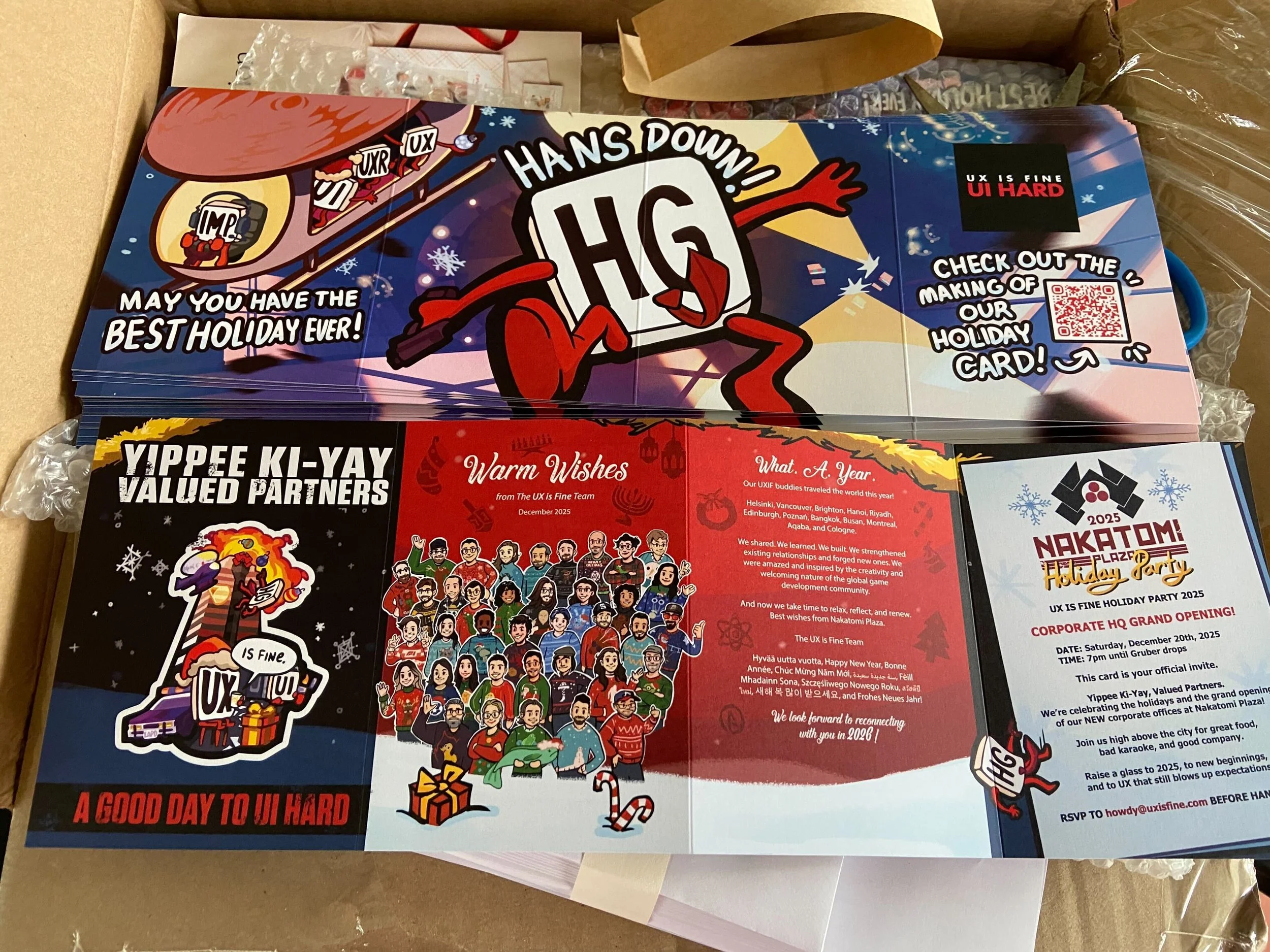
HOLIDAY CARD 2025: A GOOD DAY TO UI HARD
At UX is Fine, our holiday card is less a solemn year in review and more a chance to relax, have some fun, and make something that hopefully earns a grin before it ever earns a place on someone’s fridge. Every year we pick a movie theme, crack jokes in Slack, and see where the collective chaos takes us. Last year it was Christmas Vacation. This year we went even more delightfully off script and embraced Die Hard, which is absolutely a holiday film in our book and filled with iconic visuals that beg for illustrator mischief. The card becomes a small shared tradition for us, a reminder that we like to have fun together and never take our own marketing too seriously.
Kicking Off With Die Hard
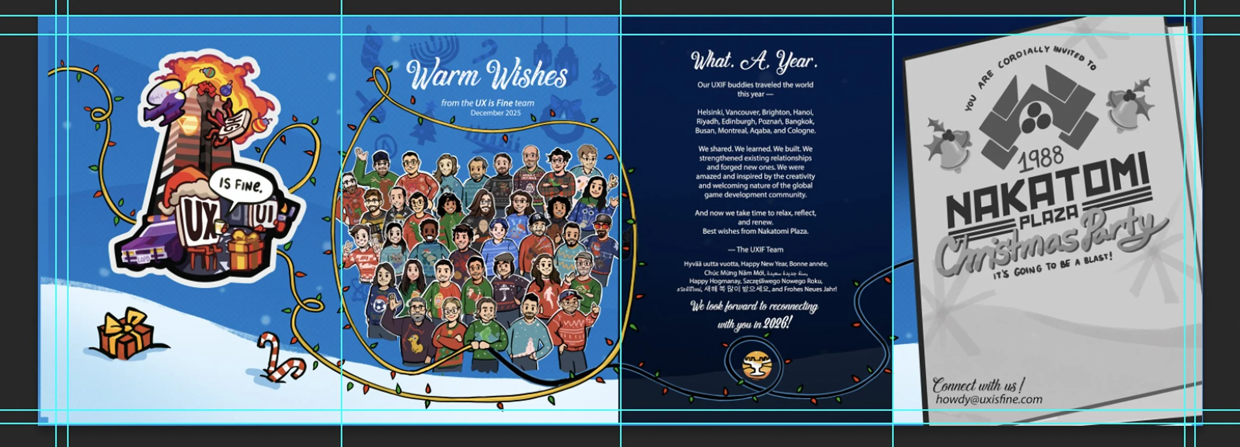
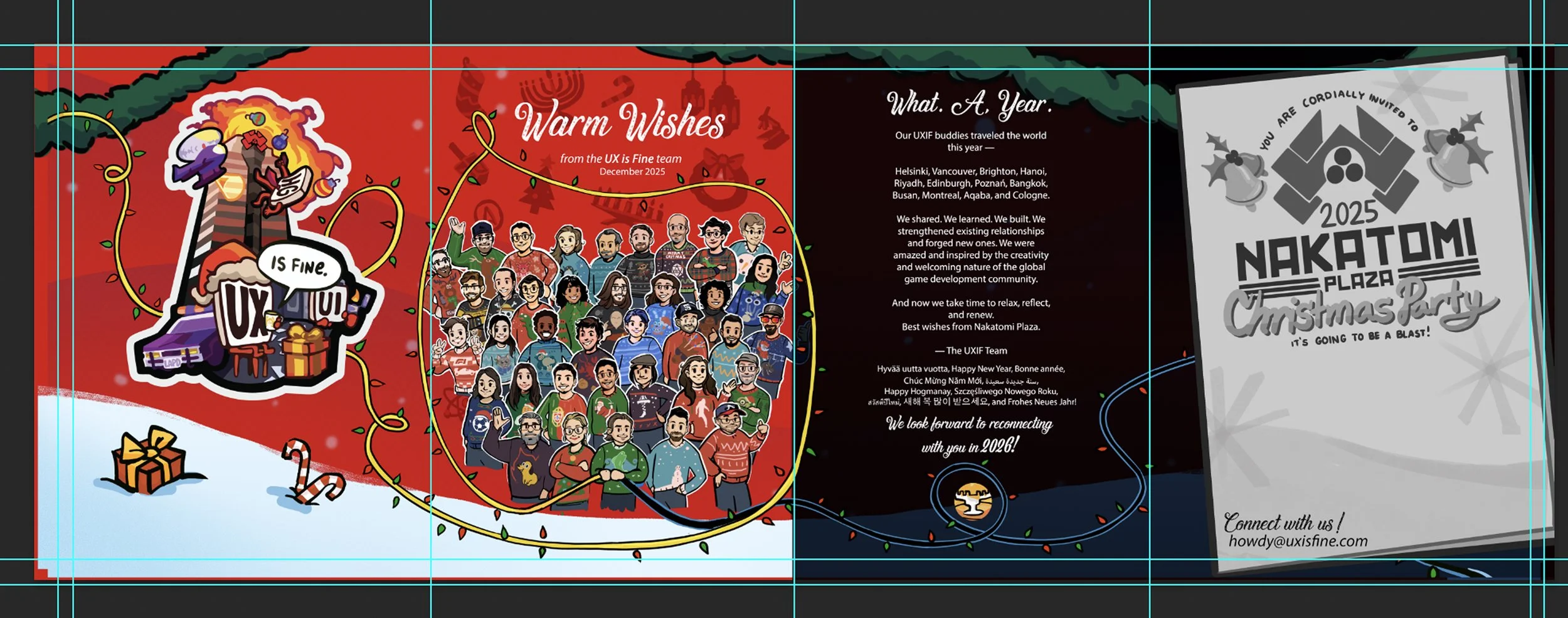
The idea really took shape when UX is Fine founder and president Dave Inscore recorded a Loom and shared a FigJam board built around a Die Hard-inspired holiday card. That early exploration, shown below, revealed several playful directions, including the idea of a Nakatomi Plaza Christmas party invite, which immediately set the kind of humor we wanted to chase. Once it landed in Slack, Evan and I jumped in and the creative work began in earnest. Evan pushed composition, clarity, and the big graphic beats, while I focused on bringing forward the film's cinematic moments and lighthearted tone to turn the film’s iconography into something festive. We kept our attention on the bright, joyful elements, avoiding anything too gritty while still having fun with the movie's most recognizable cues. One of the things we enjoyed most was watching that early Nakatomi party “card within a card” idea cause a brief moment of confusion for a teammate who wondered if a real office opening was being announced. It captured the tone we hoped for. Something that feels just real enough to spark a double-take before settling into the cheerful tradition we love creating each year.
WORKING TOGETHER WITH EVAN
Once the initial FigJam and Loom were shared, the real momentum came from the way our team collaborates. We work asynchronously across Slack, FigJam, and Loom, and that rhythm creates a kind of rolling creative energy. Ideas arrive, get tagged, react with a few comments, and suddenly the whole thing starts to hum. It is one of the reasons these holiday cards are so much fun. Everyone is cheering each other on, tossing in references, and building the excitement together.
Evan and I began with broad visual experiments. Neon bursts, oversized Nakatomi symbols, playful gradients, and a few compositions that stretched the illustration in some lively directions. Those early explorations helped us understand how big and graphic we could go before dialing things back. Evan has an excellent eye for readability and strong silhouettes, and his direction was essential in shaping the final layout. My focus was on bringing in the playful illustration style that suits this kind of project, finding moments of charm inside a very bold theme.
The work found its direction through that steady back and forth, and by the end of this phase we had a foundation that felt right for the rest of the card.
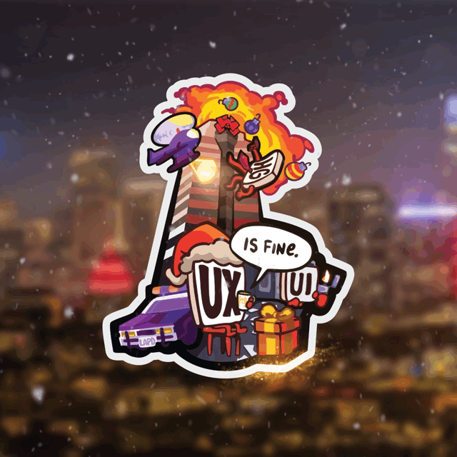
BUILDING THE STICKER
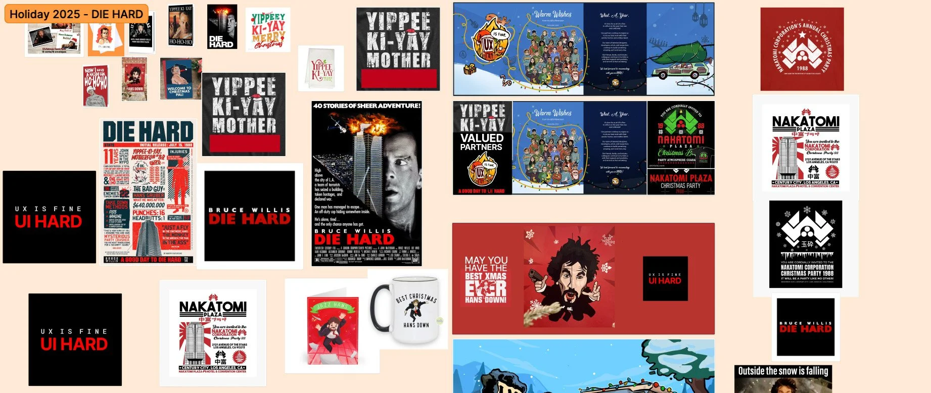
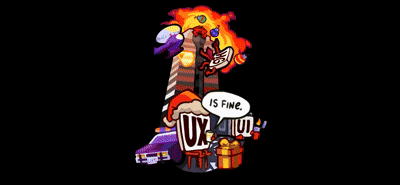
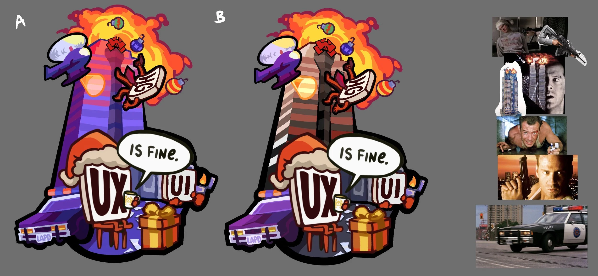
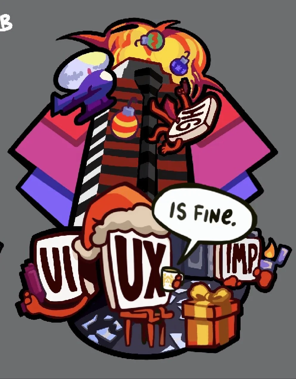
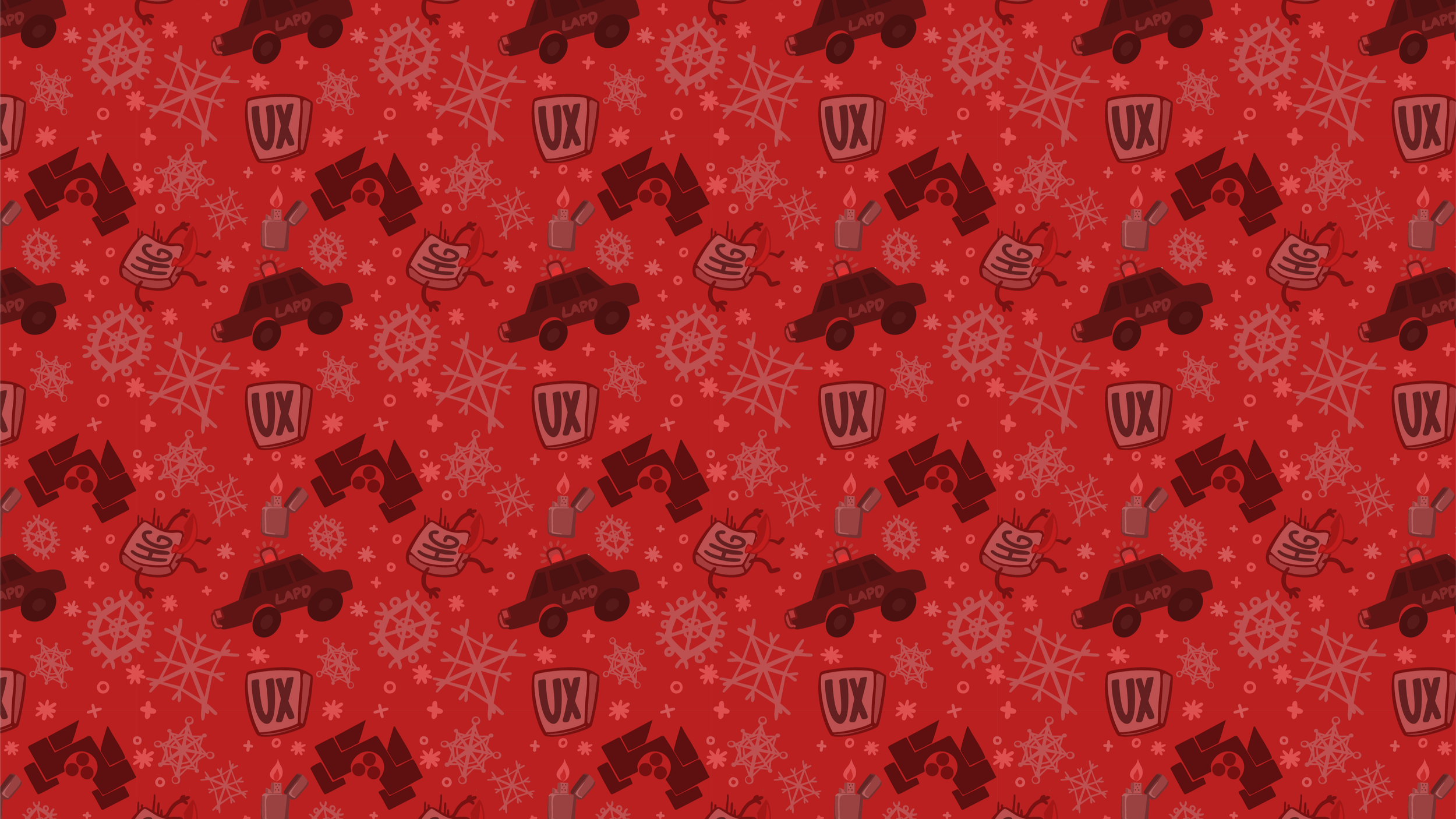
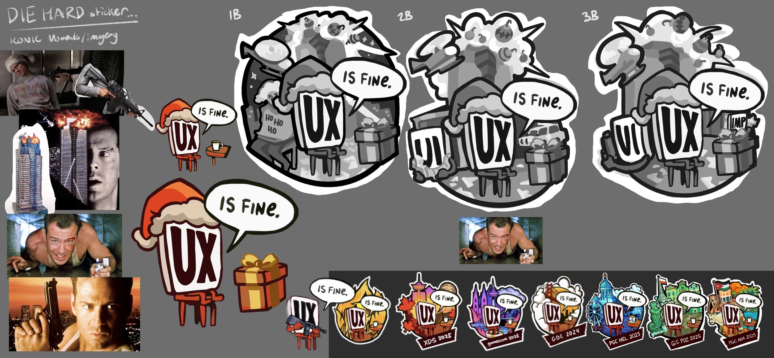
One of our longest running studio traditions is reimagining the UX is Fine logo to match whatever theme we are celebrating. We keep our core character and the familiar table and coffee mug, then rebuild the world around them for conferences, blog posts, internal events, and of course, our holiday cards. At this point we have an entire library of these variations, each one treated less like a formal logo and more like a sticker you would want to slap on a laptop. The white outline, the bold shapes, the sense of play, it all comes from that sticker mindset. It is a small design space, but it gives us permission to have fun.
For the Die Hard card, we pushed the concept further than usual. The film’s imagery is larger than life, and the sticker needed to match that energy. We brought in the essentials. Nakatomi Tower rising in the background. A sweeping helicopter. An eighties LAPD cruiser. Hans Gruber mid fall. The vent scene with a lighter flicked to life. All of it framed around our UX character in a way that still feels bright and graphic. It is probably the most adventurous sticker variation we have made, but that felt right for this theme. The card leads with it, and it became the anchor for the rest of the illustration. Once the sticker was locked in, we had a clear tone to build from, and the rest of the artwork followed naturally.
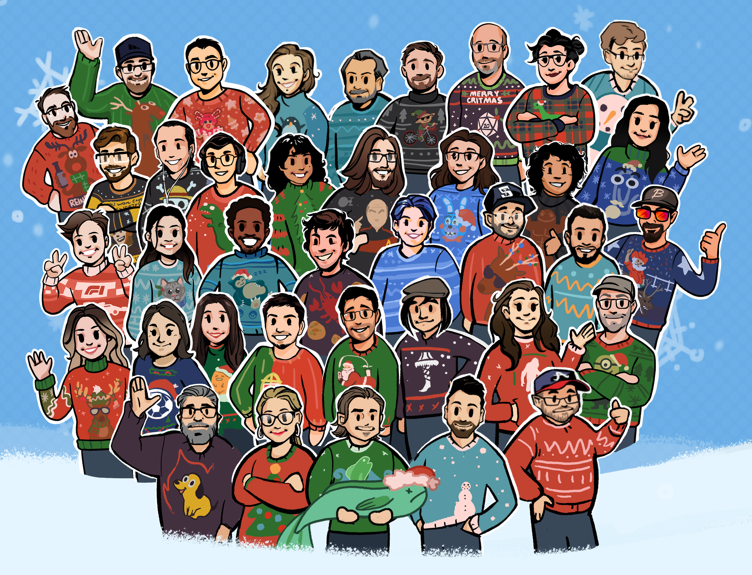
Ugly Sweater Crew
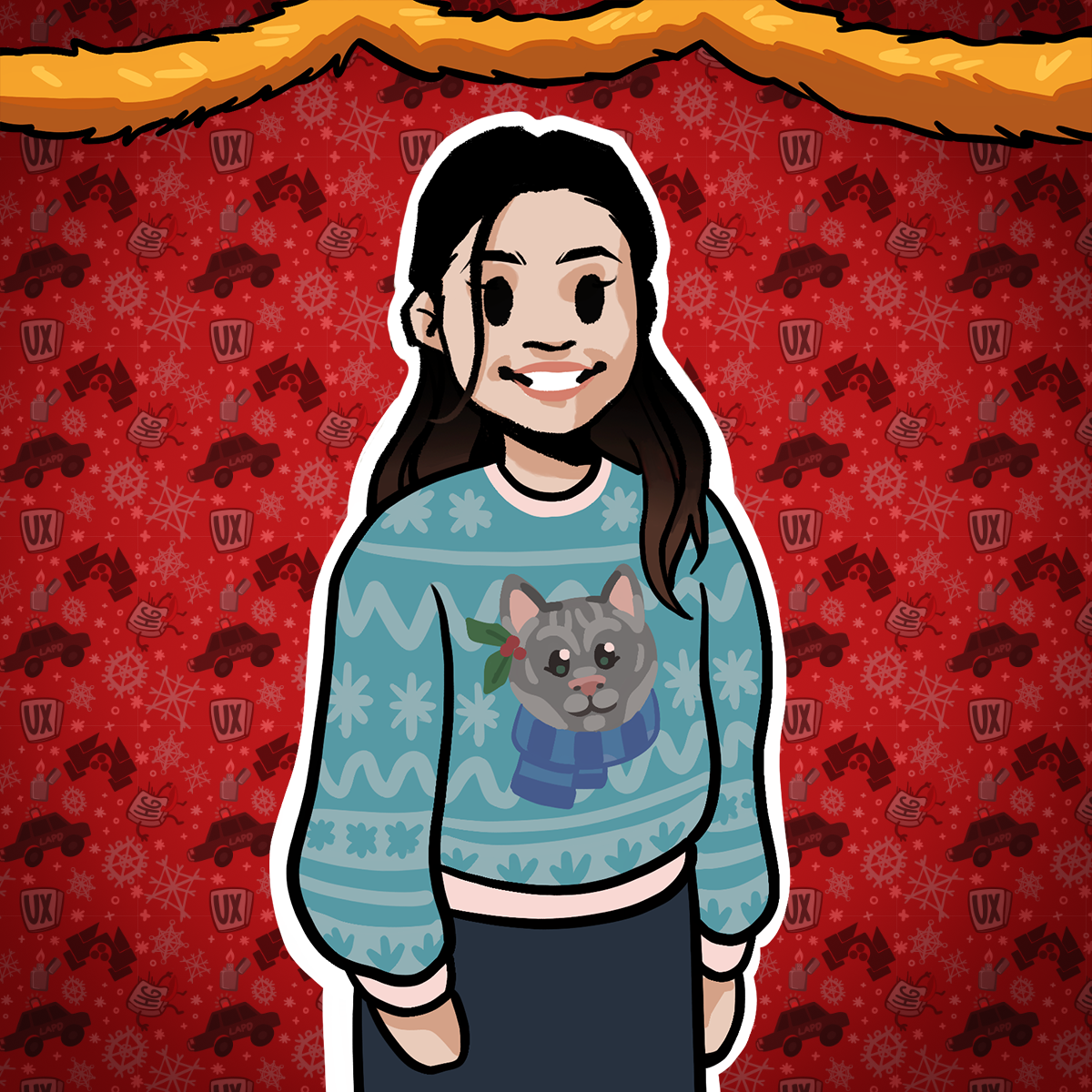
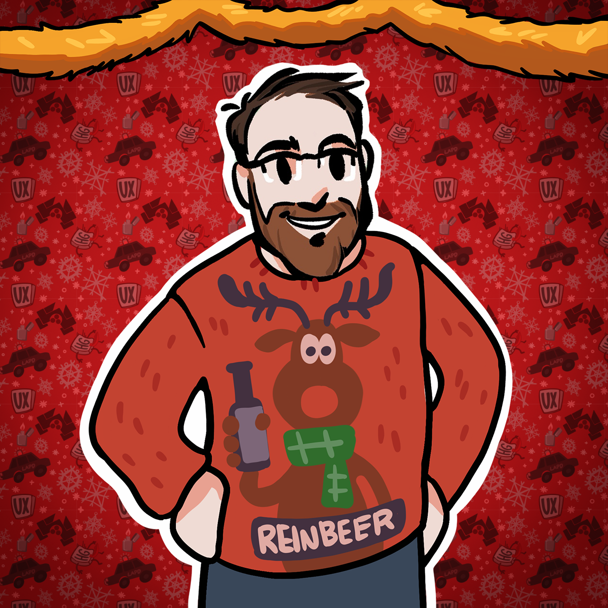
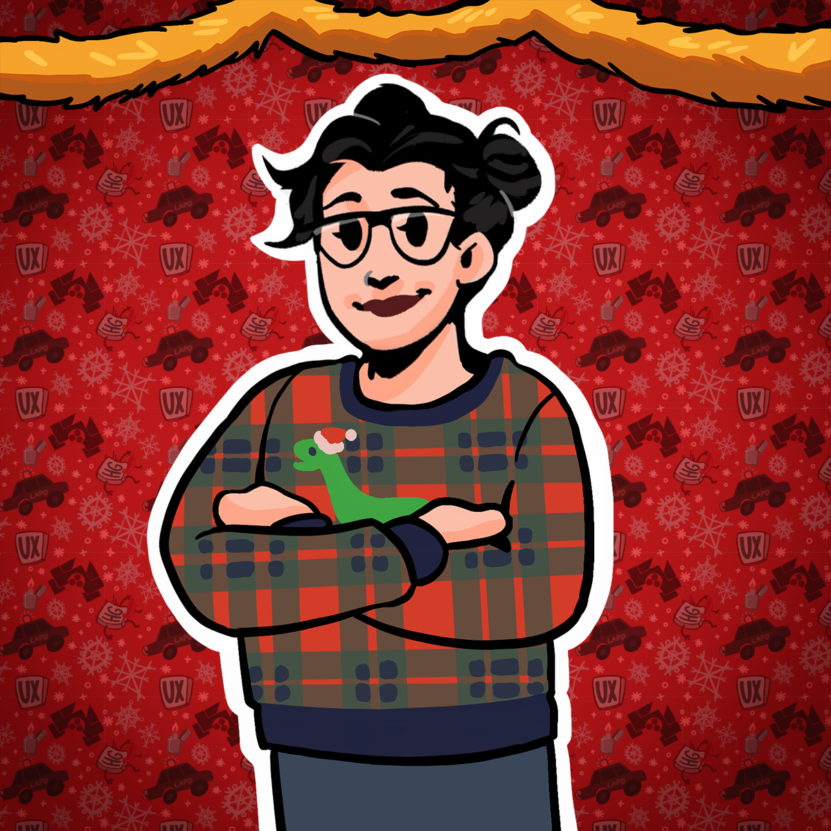
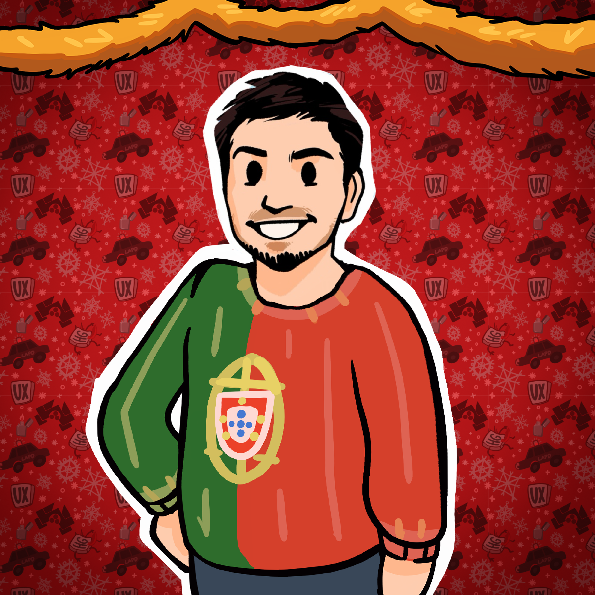
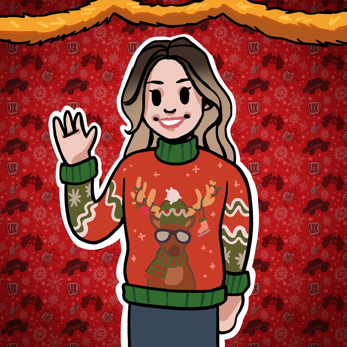
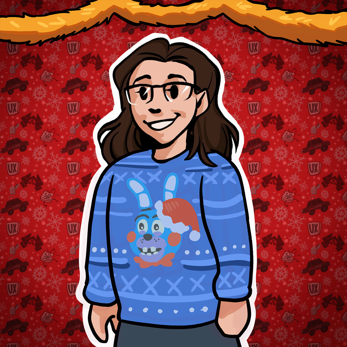
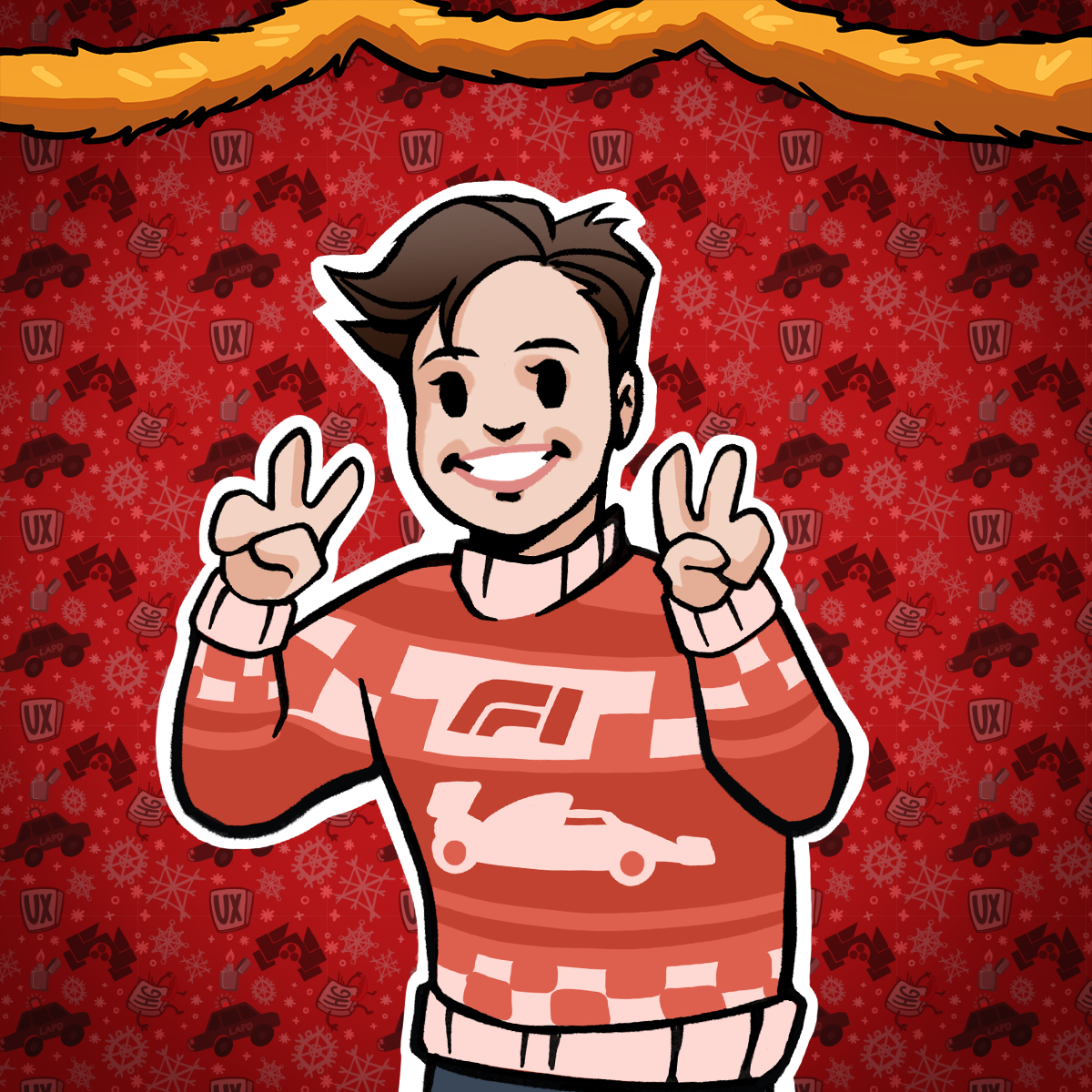
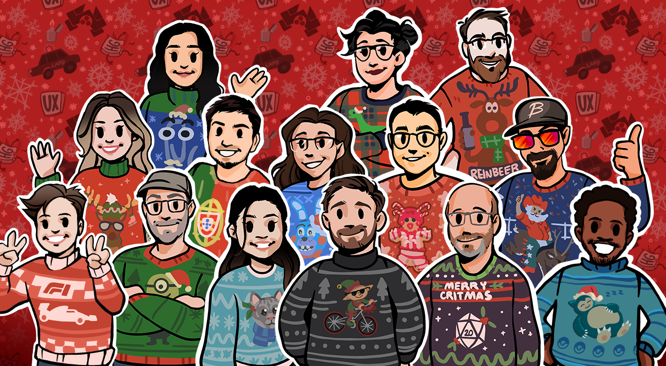
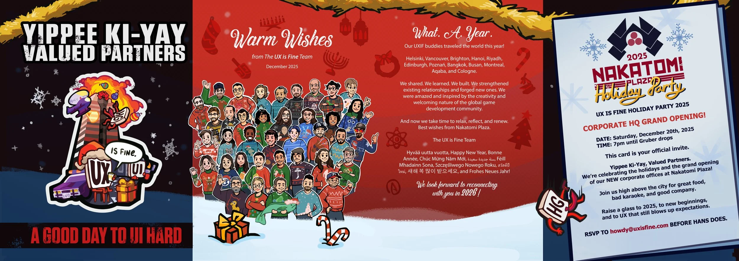
Another tradition that has become a favorite in our studio is the end-of-year Ugly Sweater Crew. Anyone who joins UX is Fine, whether full-time, freelance, contractor, advisor, or long-term collaborator, receives a custom-illustrated Slack portrait. These portraits act as our shared visual language. They appear in every channel, every thread, and every client space where we work together. Seeing everyone represented in a consistent style gives the team a unified presence that carries across every space where we collaborate.
For the holiday card, we take those portraits a step further. Each person gets a three-quarter version of their character wearing an ugly sweater of their own design. Everyone chooses the theme—pets, hobbies, favorite games, inside jokes, anything that feels personal. Mine includes Formula 1, of course, because that is very much my jam. No two sweaters match, and seeing all of them together is a simple way to show the range of personalities that make up the studio.
Since we work asynchronously and don’t gather in a physical office, this illustration serves as our group photo. It brings everyone together in one place, celebrates their individual interests, and captures the feeling of a team that shares space creatively, even when we are not in the same room. It is a lighthearted tradition, but it has become a meaningful way to close out the year and mark how our crew continues to grow.


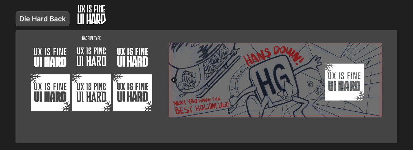
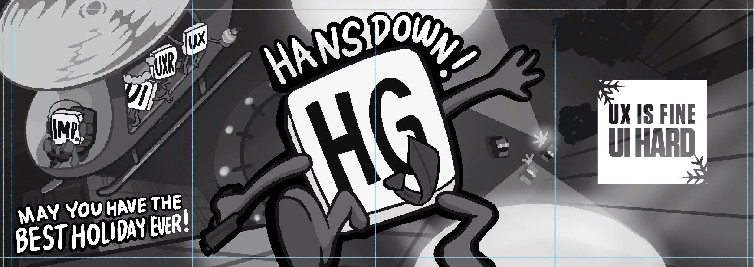
MOVING ON: PANORAMIC ILLUSTRATION
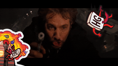
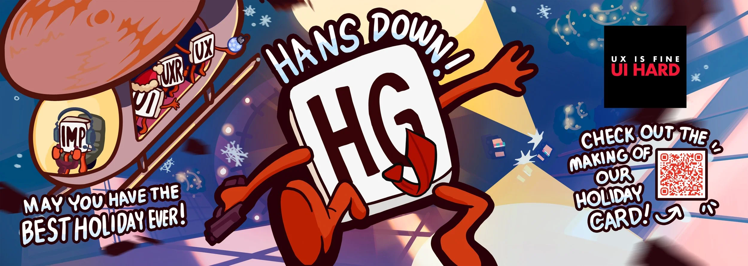
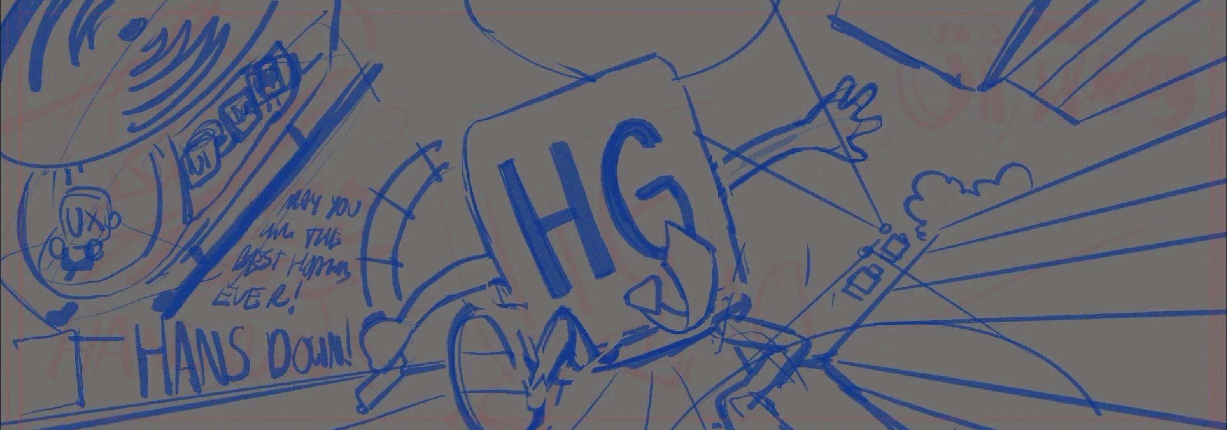
Once the sticker and sweaters finished up, we moved on to the widescreen illustration that fills the back of the card. This is always the space where we let the theme stretch out a bit. For Die Hard, it was clear from the start that the final scene had to anchor the back. The falling shot of Hans Gruber is one of the most recognizable images from the film, and it translated perfectly into our taller four panel layout. We kept the perspective looking down from the height of Nakatomi Plaza, with police cars far below and our small HG character drifting through the frame, wide eyed and holding that classic pose.
We tucked in a few other playful nods around the composition. Our little UI, UXR, and UX buddies appear in a helicopter off to the side, matching the cameo spirit we use in other cards. It all sets the stage for the final line of the card, a simple holiday wish delivered with a wink to the movie’s ending.
The RESULTS
WHY THIS CARD MATTERS
Remote work means we do not gather for a traditional team photo, so this card fills that role for us. It puts everyone in one place, highlights their interests, and gives partners a genuine look at the people behind the work. The sweaters, the cameos, and the Die Hard references all reflect the tongue in cheek personality and day to day humor that runs through the studio. It feels true to how we work together, even while spread across different locations.
Working on this card with Evan and Dave was a highlight of my year. It captured the mix of teamwork, curiosity, and steady collaboration that keeps the studio moving. The end result carries our voice clearly, and if it brings a smile to anyone who receives it, then it has done exactly what we hoped.
Yippee ki yay, and happy holidays from all of us at UX is Fine.
— SophiE Sala Artist, UX is FineABOUT THE AUTHOR

Sophia “Sophie” Sala is a freelance artist at UX is Fine based in Annapolis, Maryland, specializing in illustration, background art, visual development, and animation. She loves expressive characters, detailed environments, and the kind of visual storytelling that reveals new surprises every time you look at a piece. Her work blends traditional painting influences and a playful sense of nostalgia.
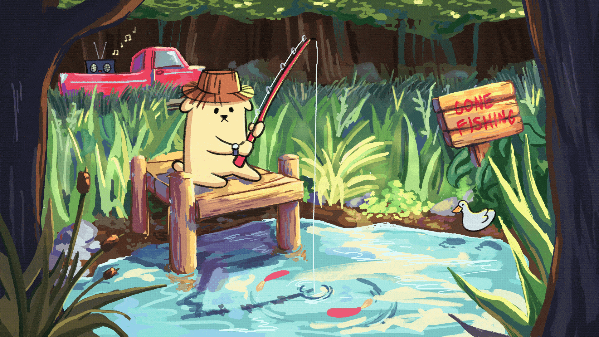
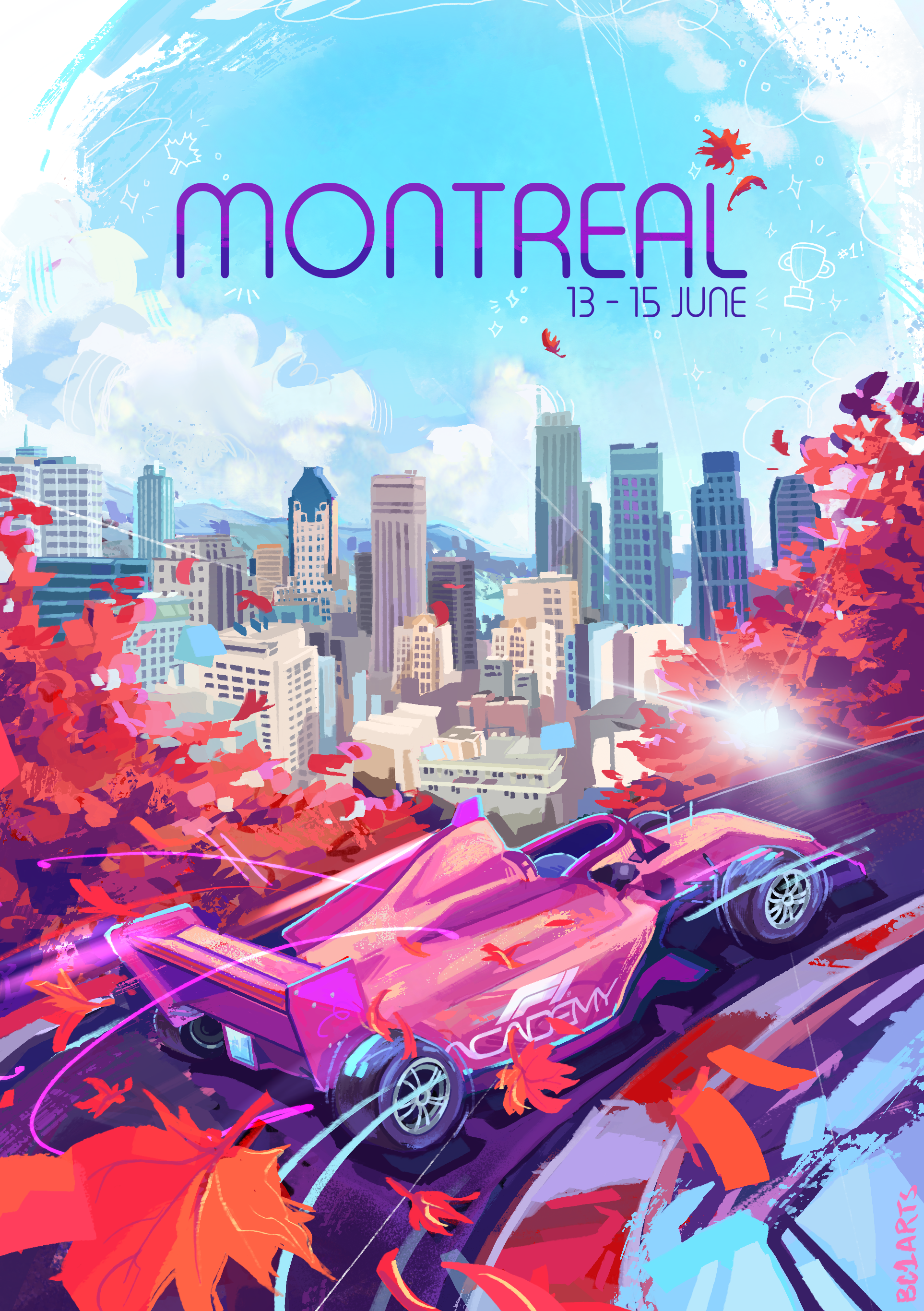
A graduate of the Maryland Institute College of Art, Sophie has created art for clients across entertainment, sports, and digital media. Her work includes projects with NTT INDYCAR Series, Arrow McLaren, Adult Swim (Kissing Party), and multiple animated short films produced at MICA including Sanctuary: Grand Reopening and The Seagull and the Crow. In 2025, her work was selected as the official poster art for the Formula 1 Academy Montreal Grand Prix.
Sophie collaborates with UX is Fine on a variety of illustration-driven pieces, including our global event sticker series and special studio projects like this year’s holiday card. Her ability to pair graphic clarity with expressive detail makes her a natural fit for work that needs character, warmth, and personality.
When she is not drawing, she is probably reading a good book, watching Formula 1 and INDYCAR, hitting the gym, running on the B&A Trail, or demolishing her friends in Mario Kart.
See more of her work at www.sophiasala.com and follow her on social media at @bc1arts on Instagram and X.